The Moving Average Convergence/Divergence technical indicator (MACD) is one of the most popular momentum indicators in trading. Traders from all different markets, including FOREX, Cryptocurrencies, Stocks, and Futures, use it due to its simplicity, flexibility, and applicability.
In this article, I’m going to show you how easy it is to add this powerful indicator to your trading bot.
By The End of This Article
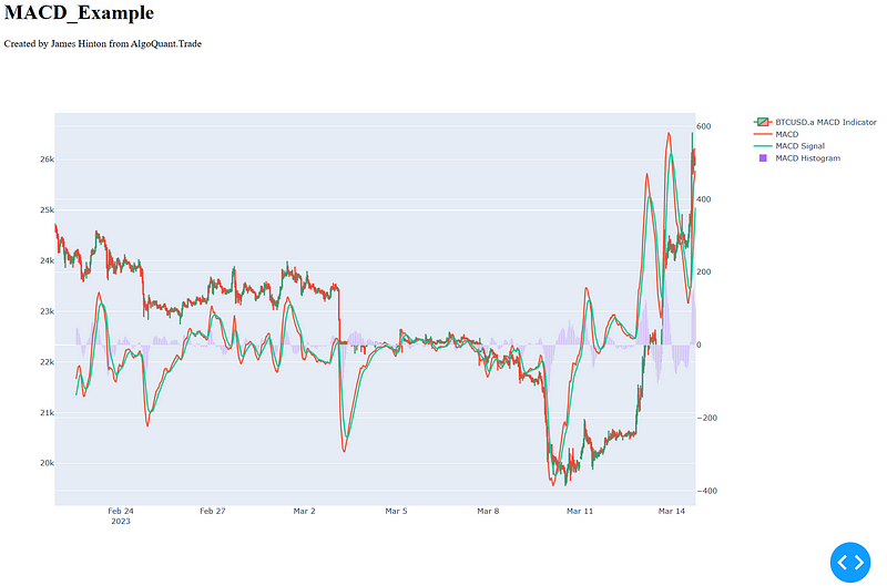
By the end of this article, you’ll be able to generate a graph that looks like this:

Prior Knowledge
There are a few pieces of information you need in order to add this indicator to your trading bot:
- TA-Lib. I use the open-source TA-Lib library to generate the signal. There is simply nothing faster. If you’re looking for insight on how to install it on Windows, check out this article.
- Retrieval of Candlestick (OHLC) data in a Pandas Dataframe. You need to be able to retrieve a minimum of 200 candlesticks and preferably at least 1000. If you’re looking for information on how to get this from MetaTrader, check out this series or YouTube video.
- Timeframe in a column called
human_time. Every exchange has a slightly different way of representing time. MetaTrader 5 uses an integer Unix Time, so make sure you convert it to a Python Datetime object using this code:dataframe['human_time'] = pandas.to_datetime(dataframe['time'], unit='s') - The following libraries installed in your Python environment: Pandas, Plotly
About the MACD
In a previous post, I did a deep dive into the MACD, including how it’s used, how it’s calculated, and some of its weaknesses. I recommend you have a read if you’d like to learn more about the theoretical background of MACD.
For this article, we’ll be focusing on the quantitative data that the MACD technical indicator uses and generates, these being:
- The input Exponential Moving Averages (EMA’s)
- The output MACD Line
- The output MACD Signal Line
- The output MACD Histogram
MACD Technical Indicator Code
Let’s convert our Candlestick data into the required MACD items.
Calculate MACD Line, MACD Signal Line, and MACD Histogram
To do this, create a new file called indicator_lib.py in your project (or add it to your existing one if you’ve been following my series).
In this file, add the following:
import talib

def calc_macd(raw_candlestick_dataframe):
    """
    Function to calculate a MACD indicator
    :param dataframe: dataframe of the raw candlestick data
    :return: dataframe with MACD values included
    """
    # Simplify the variable
    dataframe = raw_candlestick_dataframe.copy()
    # Calculate the MACD values in the dataframe
    dataframe['macd'], dataframe['macd_signal'], dataframe['macd_histogram'] = talib.MACD(
        dataframe['close'],
        fastperiod=12,
        slowperiod=26,
        signalperiod=9
    )
    print(dataframe)
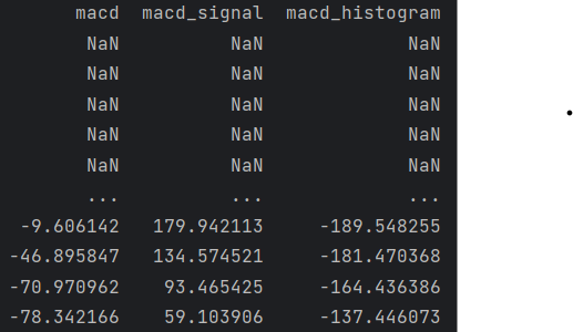
If you added this function to your __main__ and passed it a dataframe, you’d get something back that looks like this:

Your values will probably be different depending on what time you run it. You can see here that the initial values are NaN (Not a Number) as the EMA hasn’t been calculated at this stage.
Prepare Code to Pass to Plotly
Data exploration is a critical component of forex trading strategy development, so now we’ll prepare our indicator for displaying.
To do this, update your function as follows:
# Function to calculate a MACD Indicator
def calc_macd(dataframe, display=False, symbol=None):
    """
    Function to calculate a MACD indicator
    :param dataframe: dataframe of the raw candlestick data
    :param display: boolean to determine whether the MACD indicator should be displayed
    :param symbol: string of the symbol to be displayed on the graph
    :return: dataframe with MACD values included
    """
    # Calculate the MACD values in the dataframe
    dataframe['macd'], dataframe['macd_signal'], dataframe['macd_histogram'] = talib.MACD(
        dataframe['close'],
        fastperiod=12,
        slowperiod=26,
        signalperiod=9
    )
    if display:
        title = symbol + " MACD Indicator"
        fig = display_lib.display_macd_indicator(
            dataframe=dataframe,
            title=title
        )
        # Return the dataframe
        return fig
    else:
        # If not displaying, return the dataframe
        return dataframe
In this update we:
- Add in parameters to manage whether the symbol should be displayed or not
- Add branching logic to determine whether to return the dataframe with calculated values, or a figure with the values added
Now all we need to do is add in a library to display the indicator
Display MACD Indicator with Plotly
Data exploration is a critical part of trading strategy development, regardless of what market you’re trading.
One of the best ways I’ve found to explore the data is through Plotly, which has a great open-source library of charts available. We’ll leverage Plotly, and their associated Dash display library, to display our data.
If you’d like to learn more about Forex and Crypto trading, why not sign up to my YouTube Channel and Medium? The helpful content is generated for builders and explorers just like you!
The MACD has three different pieces of information which need to be displayed:
- The MACD Line
- The MACD Signal Line
- The MACD Histogram
Create Initial MACD Indicator Figure
We do this by layering each piece of information onto the graph, then creating two different Y-axis.
To do this, create a file called display_lib.py in your project (or add this code to it if you’ve already got it).
Then, construct the figure using the following code:
import plotly.graph_objects as go
from plotly.subplots import make_subplots


# Function to display a MACD indicator
def display_macd_indicator(dataframe, title):
    """
    Function to display a MACD indicator
    :param dataframe: dataframe with all values
    :param title: Title of the data
    :return: figure with all data
    """
    # Set up the figure
    fig = make_subplots(specs=[[{"secondary_y": True}]])
    # Add in the candlesticks for the original data
    fig = fig.add_trace(
        go.Candlestick(
            x=dataframe['human_time'],
            open=dataframe['open'],
            high=dataframe['high'],
            close=dataframe['close'],
            low=dataframe['low'],
            name=title
        ),
        secondary_y=False
    )
    # Add in the MACD line
    fig = fig.add_trace(
        go.Scatter(
            x=dataframe['human_time'],
            y=dataframe['macd'],
            name="MACD"
        ),
        secondary_y=True
    )
    # Add in the MACD signal line
    fig = fig.add_trace(
        go.Scatter(
            x=dataframe['human_time'],
            y=dataframe['macd_signal'],
            name="MACD Signal"
        ),
        secondary_y=True
    )
    # Add in the MACD histogram
    fig = fig.add_trace(
        go.Bar(
            x=dataframe['human_time'],
            y=dataframe['macd_histogram'],
            name="MACD Histogram"
        ),
        secondary_y=True
    )
    return fig
This code constructs the graph with four elements:
- The raw OHLC Candlestick data to provide the actual prices
- The MACD Line, MACD Signal Line, and MACD Histogram
It assigns all the MACD components to a secondary Y axis.
Create A Display Function
Now we can display our awesome MACD Technical Indicator.
Add a new function and import statement to your display_lib :
from dash import Dash, html, dcc

# Function to display a plotly graph in dash
def display_graph(plotly_fig, graph_title, dash=False):
    """
    Function to display a plotly graph using Dash
    :param plotly_fig: plotly figure
    :param graph_title: string
    :param dash: boolean to determine whether to run the dash server
    :return: None
    """
    # Add in layout features for each plotly figure
    plotly_fig.update_layout(
        xaxis_rangeslider_visible=False,
        autosize=True,
        height=800
    )
    plotly_fig.update_yaxes(automargin=True)

    if dash:
        # Create the Dash object
        app = Dash(__name__)
        # Construct view
        app.layout = html.Div(children=[
            html.H1(children=graph_title),
            html.Div("Created by James Hinton from AlgoQuant.Trade"),
            dcc.Graph(
                id=graph_title,
                figure=plotly_fig
            )
        ])
        # Run the image
        app.run_server(debug=True)
    else:
        plotly_fig.show()
This function takes the figure created earlier and passes it into a series of display layouts. This includes:
- Some formatting to remove a range slider
- Setting the height to be 800px
- Allowing Plotly to figure out the margins
Update Main
All that’s left is to update our main function so that it will display the graph. I’ll post what mine looks like below, just remember that I’ve included how I get my OHCL data (which may be different from you):
# Main function
if __name__ == '__main__':
    print("Let's build an awesome trading bot!!!")
    # Import settings.json
    project_settings = get_project_settings(import_filepath=settings_filepath)
    # Start MT5
    mt5_start = mt5_startup(project_settings=project_settings)
    pandas.set_option('display.max_columns', None)
    comment = "ema_cross_strategy"
    # If MT5 starts correctly, lets query for some candles
    if mt5_start:
        symbol = "BTCUSD.a"
        # Get data from MT5
        data = mt5_lib.query_historic_data(
            symbol=symbol,
            timeframe="M30",
            number_of_candles=1000
        )
        # Get the MACD data
        macd_fig = indicator_lib.calc_macd(data, display=True, symbol=symbol)
        display_lib.display_graph(plotly_fig=macd_fig, graph_title="MACD_Example", dash=True)
If you’d like to learn how to build your own MetaTrader 5 Python Trading Bot, then check out my series on YouTube.
Advanced Updates
As you can probably tell, by coding the functions like this, you have the ability to modify almost every aspect of the MACD Indicator. Some popular options include:
- Modifying the input EMAs (just make sure your dataframe is big enough)
- Integrating a histogram strength calculation
Let me know in the comments how you’ve modified it.
Quick Call to Action
As a creator, I love what I do. The process of designing content, developing solutions, and sharing it in meaningful ways is something I deeply enjoy. My ability to monetize this process is critical to my ability to keep doing this. You can help me continue to do this by:
- Subscribing to my Medium and Medium Email list
- Subscribing to my YouTube channel
- Signing up to Medium via my referral link, where Medium will contribute 50% of the fees to me while costing you nothing extra
- Signing Up to my website AlgoQuant.Trade
I also love hearing from my readers, so reach out to me on LinkedIn, Instagram, or my contact page.
Say Hi!
I love hearing from my readers, so feel free to reach out. It means a ton to me when you clap for my articles or drop a friendly comment — it helps me know that my content is helping.
❤

